
 From this site – courtesy of Krugman.
Recent Comments
- David Walker on Domestic violence in Australia: some things the statistics say (and the media should report)
- David Walker on Domestic violence in Australia: some things the statistics say (and the media should report)
- David Walker on Domestic violence in Australia: some things the statistics say (and the media should report)
- R. N. England on Domestic violence in Australia: some things the statistics say (and the media should report)
- Nicholas Gruen on Domestic violence in Australia: some things the statistics say (and the media should report)
- Nicholas Gruen on Orwell that ends well: Can evaluation save us from ourselves?
- Nicholas Gruen on Will you join me in the alt-centre?
- Nicholas Gruen on A conservative liberal social democrat
- Nicholas Gruen on A metaphor, a hack, a ladder: On the difficulty of telling yourself the truth
- Nicholas Gruen on Orwell that ends well: Can evaluation save us from ourselves?
- Nicholas Gruen on Trust and the competition delusion: A new frontier for political and economic reform
- Nicholas Gruen on Adam Smith was a feminist economist: Care – the essay
- Two types of strategy: Part One | Club Troppo on Cometh the hour: Paul Krugman’s Nobel
- Nicholas Gruen on Where equity and efficiency thrive together: Can you propose some more examples?
- The strange alchemy by which we built a world of bullshit | Club Troppo on “Values based management”
Subscribe to Blog via Email
Categories
-
Authors
Archives
Author login and feeds
Academic
Alternative media (Australian)
Alternative media (international)
Arts
Business
Centrist
Economics and public policy
Left-leaning
Legal
Online media digests
Psephology/elections
Right-leaning
Unless Krugman shows evidence for his theory, we should treat these comments as one would from a snakeoil peddler..
What’s interesting is how he is silent about the 11 million illegals in the US… as though that number doesn’t have an effect on lower wages.
The professor ought to focus on his core competetency… promoting hatred of the GOP.
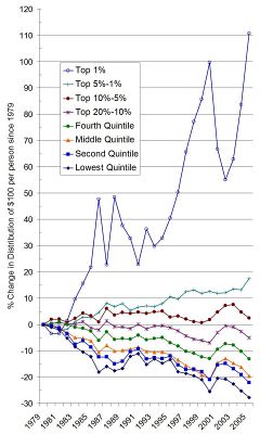
The three charts in this Economist feature are each (even the innovative but not actually very good third) better than that one (although understandably so since this one has not been selected for any great quality, but for the information it purports to convey).
None of them, for example, obscures the entire point of the exercise! Such as the number of $100 notes or the value of each note to the recipient.
Incidentally, the weekend AFR had a ‘review’ of Krugman’s book, too. It was barely more than hagiography, as demonstrated by the ultimate sign of the partisan hagiographer: what the reviewer likes best about Krugman is that, in politics as in (as far as the reviewer could discern) in economics, he strives not to persuade but merely to state things as they actually are.
Obviously that’s a rare virtue – the other side(s) (and by implication most of the reviewer’s own side!) are clearly trying to deceive their audiences!
Anyone who sincerely believes such a proposition in such general terms is a partisan nut. Since I believe the reviewer to be one of the parties responsible for The Guardians’s famously dumb electioneering stunt in 2004, this is probably not a contentious statement in this case.
I guess I am stating the obvious but the vertical axis measures the “percentage change in the percentage of wealth” which is a pretty strange measure. The top 1% are always going to have a smallish portion of the distribution – so relatively modest increases will give large percentage increase.
On a quick glance, the graph suggests the lower percentile groups are doing worse absolutely. It would be nice to see this graph along side one that plotted absolute wealth rather than relative.
Thaks for the head-up on the old graphics Patrick. I may talk about them on my stats blog later in the month. Happy New year to all. Drive safely. And a big thanks to Ken, Nick and Jacques for founding/populating/maintaining this great blog.
Nicholas, as Chris pointed out, the chart doesn’t show “growth in incomes in the US”. It shows a change in the share of income. Moreover, it’s not worth a thousand words. I’d give it three, tops, and specifically the following words: “very”, “dodgy” and “chart”. This post explains the chart’s creation.
A handy antidote to this doom-mongering distortion is another article in the excellent Christmas edition of The Economist: “The new (improved) Gilded Age”.
Here’s Greg Mankiw’s blog piece about Krugman’s article, more or less saying what i said. Nice to see greg agrees with me for a change :-)
There’s nothing wrong with examining the changes in the share of income received by different income quintiles. What makes this graph unhelpful is that the ‘growth rates’ are calculated using the shares themselves as the base, rather than the total. The reference to ‘$100’ on the vertical axis also helps to confuse things. If we are calculating percentage changes, the original choice of index is irrelevant.
But there is no shortage of statistics testifying to the worsening of America’s income distribution, so I don’t know why anybody would get all indignant about this perticular, poorly conceived graph.
“Worsening” relative to what? The top 1% of income earners take a small fraction of the total income pool, so a small change in their share looks large in percentage growth term but says nothing meaningful about the distribution of income as experienced by the bulk of the population. Going from, say, 1% to 1.5% share of income is a 50% increase, but does it mean anything? The chart LOOKS impressive, but it’s an artefact. Compare it to the other charts in the link I presented earlier – looking strictly at quintiles shows a distinctly less dramatic change. Yes, the top quintile has increased its share, but at a much more moderate rate.
Essentially, what Krugman et al are whinging about is the likes of Oprah Winfrey, Bill Gates, professional athletes and hedge fund managers making a lot more money than they used to. If Bill Gates makes two billion dollars a year rather than one billion dollars, does that make other Americans worse off?
Likewise, relative inequality as measured by income shares may be worse than a couple of decades ago, but what does that mean if the US population, including those beneath the poverty line, is experiencing better ABSOLUTE living conditions?
Krugman’s necessarily implied thesis is that relative inequality is more important to well-being than absolute wealth. If, as I do, you disagree, it is hard to get that excited. But it is interesting to consider how many people, given a Rawlsian veil, would choose the more equal but absolutely worse world to the less equal but absolutely better.
JF: what there is to get indignant about is that Krugman surely knows a thing or two about graphs. One is entitled to presume that he chose this one despite its deficiencies because he thought it illustrated his point best. Bye-bye economist, hello partisan
hackcolumnist.Fyodor said:
I think you might be missing the overall point being made by the graph’s author (who isn’t Krugman, BTW). It’s that concentration of wealth can, in fact be a bad thing in and of itself, because it can enable a complete takeover of goverment by the wealthy, despite the presence of democratic trappings like elections. From Roosevelt in 1942:
The income share of the top 1% is a lot greater than Fyodor implies
See http://www.econlearning.com/top10_various.pdf
This shows that the share of market income received by the richest 1% increased from around 8% in the late 1960s and early 1970s to around 15% more recently.
Of course the final income distribution is more equal than the market distribution.
Really? Obama , the present front runner, has a net worth of $1 million dollars- the lowest of any of the serious contenders. When Bill Clinton first ran he didn’t own his own home having lived in public housing as a Governor. He beat twowealthy guys.
What a silly idea. Let’s raise taxes to ensure your idea of ” equality” so rich dudes like John Edwards aren’t enticed into running for office.
what’s more there’s little evidence of your assertion.
And although it may not be krugman’s chart he uses it to promote a dishonest or shoddy argument.
Point me to where exactly Krugman used the chart.
Regardless of the truth of this assertion, when a right wing nutcase like Joe Cambria suddenly feels the need to step in and defend a Democrat candidate, one starts to suspect that there’s some truth in the suspicions that Obama is just another Bush clone.
spewing venom as usual , SJ.
He’s a black liberal democrat who wants to remove the troops asap and voted against the war. Given the chance I’ll be voting for him like other right/ libertarians. Some clone, you moron.
Try an argeument next time , you leftist envy ridden nutjob . LOL.
What evidence of this is there in any Anglo-saxon western state?
This is simply the politics of envy and hatred.
Rossevelt is wrong. The protection of the individual FROM the state (democratic or otherwise) relies on the growth in private power of the individual. The whole point is that the interests of the rich align with the interests of the masses. The Magna Carta, The English Civil War and The Declaration of Independence were all products of some of the wealthiest and most influential individuals in society overcoming the entrenched power of the state.
The Russian and Chinese states may one day come to fear the billionaires that are being created in the midst of the breakdown of socialism and the command economy. Already the Russian state is struggling to control rich wealthy Russian dissdents both abroad and domestically and have resorted to extrajudicial executions (Litvinenko, who was connected to the wealthy Boris Berezovsky) and dubious incarceration (Khodorkovsky, formerly 16th richest man in the world).
The richer individuals become, the less power the state has over them, and the more resources they can dedicate to keeping the state in check.
The other (possibly major) law in the chart is that it says nothing about movement between the quintiles. It implicitly assumes that the people in each section in 1979 are the same in 2005/6 – clearly nonsense.
The Economist article that Fyodor linked to (in #5) comprehensively pulls Krugman apart.
In Fyodor’s link we find
Interesting to see that a right wing correspondent is willing to quote happinss research when it suits them!
But the more interesting point being made there is that consumption may be more equal than income. Certainly, there is no way Bill Gates can comsume a fraction of what he makes. And Kerry Packer famously decided to stop taking his life preserving drugs because hsi life was not how the richest man in Australia should live. His wealth bought him power though.
Rent seeking brought him power. Not his wealth. It was state granted monopolies that offered that kind of wealth. Most of his ventures where he had to compete weren’t exactly sterling successes.